Jodie Dang Architects
Jodie Dang Architects
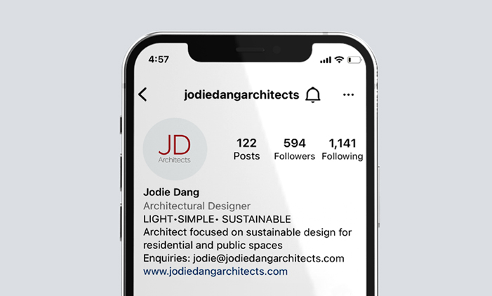
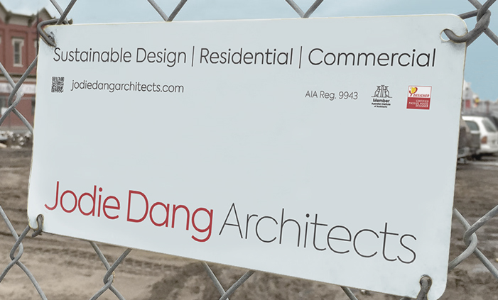
Logo, digital booklet and site sign for an architectural business specialising in sustainable building practices


“Noakes Design's solution expressed our brand ethos and identity. Heather is meticulous, thorough and takes an open-communication approach. We enjoyed the experience of watching our identity come to life”.
Jodie Dang, Principal, Jodie Dang Architects


When creating the logo, an uncluttered, symmetrical font was presented which resonated with the architect's design style and philosophy. A deep red was integrated into the logo symbolising energy, courage and warmth, which is the architect's signature colour. As a sustainable practice, a design and build process booklet needed to work in a digital format, with the option for clients to print out easily. The clean layout of the booklet also reflected the architect's aesthetic for space and geometry. To avoid single use plastic, a reusable aluminium site sign was devised, which attaches to the building site fence with wire.
Like what you see? Please contact me to find out more.